Every website need the button on the page, button is the main focus to capture the user input data for the website. Today I am also discussing about the button and how we can better use the CSS3 to create the nice and elegant and fancy normal and 3D buttons.
In old traditional method we use the button html control in the web page, But it looks was not elegant like Button created in CSS3. We are going to use also same old button html control with CSS3 and it make the button to nice and with good transition effects. We can create the beautiful rounded corner css button using css3 which we can;t do with older version of css.
Before we are going to use of css we need to create the html button control using the following syntax. We can place button to any other html container on the web page.
<button class=”bot”>Push Button</button>
Now we need to write the css for the button. We can place as on style tag in head section or we can create the external css file and can put link in head section of the page.
<style>
body {background-color:#c263c2}/* common css for button */
button
{
position: relative;
color: rgba(255,255,255,1);
text-decoration: none;font-family: “Trebuchet MS”, Arial, Helvetica, sans-serif;
font-weight: bold ;
font-size: 2.2em;
display: block;
padding: 20px;
margin: 120px auto;
width: 240px;
text-align: center;
border:0px;
outline:0px;}
</style>
1) Top Dropshadow 3D CSS Push Effect Button
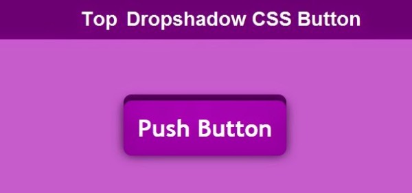
<button class=”bot”>Push Button</button>
/* css for the Button */
.top {background-color: rgba(153,14,153,1);
-webkit-transition: all .1.5s ease;
-moz-transition: all .1.5s ease;
-ms-transition: all .1.5s ease;
-o-transition: all .1.5s ease;
transition: all .1.5s ease;-webkit-border-radius: 12px;
-moz-border-radius: 12px;
border-radius: 12px;-webkit-box-shadow: 0px 0px 25px rgba(0,0,0,.7), 0px -9px 0px rgba(105,7,105,1);
-moz-box-shadow: 0px 0px 25px rgba(0,0,0,.7), 0px -9px 0px rgba(105,7,105,1);
box-shadow: 0px 0px 25px rgba(0,0,0,.7), 0px -9px 0px rgba(105,7,105,1);}
/* When the button is clicked */
.top:active{-webkit-box-shadow: 0px 0px 6px rgba(0,0,0,.9), 0px -3px 0px rgba(153,14,153,1);
-moz-box-shadow: 0px 0px 6px rgba(0,0,0,.9), 0px -3px 0px rgba(153,14,153,1);
box-shadow: 0px 0px 6px rgba(0,0,0,.9), 0px -3px 0px rgba(153,14,153,1);
position: relative;
top: 10px;
border:0px;
}
2) Bottom Dropshadow 3D CSS Push Effect Button
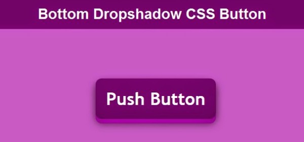
<button class=”bot”>Push Button</button>
/* css for the Button */
.bot {background-color: rgba(105,7,105,1);
-webkit-transition: all .1.5s ease;
-moz-transition: all .1.5s ease;
-ms-transition: all .1.5s ease;
-o-transition: all .1.5s ease;
transition: all .1.5s ease;-webkit-border-radius: 12px;
-moz-border-radius: 12px;
border-radius: 12px;-webkit-box-shadow: 0px 9px 0px rgba(153,14,153,1), 0px 9px 25px rgba(0,0,0,.7);
-moz-box-shadow: 0px 9px 0px rgba(153,14,153,1), 0px 9px 25px rgba(0,0,0,.7);
box-shadow: 0px 9px 0px rgba(153,14,153,1), 0px 9px 25px rgba(0,0,0,.7);}
/* When the button is pushed or active */
.bot:active
{
-webkit-box-shadow: 0px 3px 0px rgba(153,14,153,1), 0px 3px 6px rgba(0,0,0,.9);
-moz-box-shadow: 0px 3px 0px rgba(153,14,153,1), 0px 3px 6px rgba(0,0,0,.9);
box-shadow: 0px 3px 0px rgba(153,14,153,1), 0px 3px 6px rgba(0,0,0,.9);
position: relative;
top: 10px;
border:0px;}
If we use the good custom font in css then button will be look awesome using the custom font. If you are aware of the embedding custom font then you must need to read how to embed custom font in the css?.
Now Let i am showing how we can make the The following example of the CSS buttons with pseudo-elements and we are going to use the power of the css by mixing the the buttons to create the elegant css button and it will change the look of your button.
3) CSS buttons with Pseudo Elements
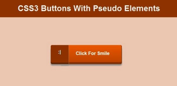
<button class=”pseudo “>Push Button</button>
button
{outline:0px;
padding:20px 40px 20px 50px;
height: 60px;
background-color:#EC6817;
font-family: ‘Open Sans’, sans-serif;
font-size:16px;
font-weight:bold;
text-decoration:none;
color:#fff;
position:relative;
border-left:solid 1px #EC6817;
margin-left:55px;
}/* css for the Button */
.pseudo {-webkit-border-top-right-radius: 5px;
-webkit-border-bottom-right-radius: 5px;
-moz-border-radius-topright: 5px;
-moz-border-radius-bottomright: 5px;
border-top-right-radius: 5px;
border-bottom-right-radius: 5px;background-image: linear-gradient(bottom, rgb(219,87,5) 0%, rgb(244,104,17) 100%);
background-image: -o-linear-gradient(bottom, rgb(219,87,5) 0%, rgb(244,104,17) 100%);
background-image: -moz-linear-gradient(bottom, rgb(219,87,5) 0%, rgb(244,104,17) 100%);
background-image: -webkit-linear-gradient(bottom, rgb(219,87,5) 0%, rgb(244,104,17) 100%);
background-image: -ms-linear-gradient(bottom, rgb(219,87,5) 0%, rgb(244,104,17) 100%);
background-image: -webkit-gradient( linear, left bottom, left top, color-stop(0, rgb(200, 83, 11)), color-stop(1, rgb(244,104,17)) );
border-color:#EC6817;
border-top:none;-webkit-box-shadow: inset 0px 1px 0px #EC6817, 0px 5px 0px 0px #903B07, 0px 10px 5px #999;
-moz-box-shadow: inset 0px 1px 0px #EC6817, 0px 5px 0px 0px #903B07, 0px 10px 5px #999;
-o-box-shadow: inset 0px 1px 0px #EC6817, 0px 5px 0px 0px #903B07, 0px 10px 5px #999;
box-shadow: inset 0px 1px 0px #EC6817, 0px 5px 0px 0px #903B07, 0px 10px 5px #999;
}.pseudo:active {
border-color:#EC6817;
border-top:none;
border-right:solid 1px #CB530A;
border-bottom:solid 1px #CB530A;
min-height:30px;
top:3px;background-image: linear-gradient(bottom, rgb(244,104,17) 0%, rgb(219,87,5) 100%);
background-image: -o-linear-gradient(bottom, rgb(244,104,17) 0%, rgb(219,87,5) 100%);
background-image: -moz-linear-gradient(bottom, rgb(244,104,17) 0%, rgb(219,87,5) 100%);
background-image: -webkit-linear-gradient(bottom, rgb(244,104,17) 0%, rgb(219,87,5) 100%);
background-image: -ms-linear-gradient(bottom, rgb(244,104,17) 0%, rgb(219,87,5) 100%);
background-image: -webkit-gradient( linear,
left bottom,
left top,
color-stop(0, rgb(200, 83, 11)),
color-stop(1, rgb(219,87,5))
);
-webkit-box-shadow: inset 0px 1px 0px #EC6817, 0px 2px 0px 0px #903B07, 0px 5px 3px #999;
-moz-box-shadow: inset 0px 1px 0px #EC6817, 0px 2px 0px 0px #903B07, 0px 5px 3px #999;
-o-box-shadow: inset 0px 1px 0px #EC6817, 0px 2px 0px 0px #903B07, 0px 5px 3px #999;
box-shadow: inset 0px 1px 0px #EC6817, 0px 2px 0px 0px #903B07, 0px 5px 3px #999;
}.pseudo::before {
font-size:16px;
background-color:#CE5409;
content:”:|”;
width:20px;
max-height:30px;
height:100%;
position:absolute;
display:block;
padding:15px 20px;
top:0px;
left:-36px;
font-size:16px;
font-weight:bold;
color:#fff;
text-shadow:1px 1px 0px #07526e;
border-right:solid 1px #973D05;-webkit-border-top-left-radius: 5px;
-webkit-border-bottom-left-radius: 5px;
-moz-border-radius-topleft: 5px;
-moz-border-radius-bottomleft: 5px;
border-top-left-radius: 5px;
border-bottom-left-radius: 5px;background-image: linear-gradient(bottom, rgb(153, 62, 7) 0%, rgb(150, 60, 4) 100%);
background-image: -o-linear-gradient(bottom, rgb(153, 62, 7) 0%, rgb(150, 60, 4) 100%);
background-image: -moz-linear-gradient(bottom, rgb(153, 62, 7) 0%, rgb(150, 60, 4) 100%);
background-image: -webkit-linear-gradient(bottom, rgb(153, 62, 7) 0%, rgb(150, 60, 4) 100%);
background-image: -ms-linear-gradient(bottom, rgb(153, 62, 7) 0%, rgb(150, 60, 4) 100%);
background-image: -webkit-gradient(
linear,
left bottom,
left top,
color-stop(0, rgb(153, 62, 7)),
color-stop(1, rgb(150, 60, 4))
);-webkit-box-shadow:inset 0px 1px 0px #973D05, 0px 5px 0px 0px #6F2D04, 0px 10px 5px #999 ;
-moz-box-shadow:inset 0px 1px 0px #973D05, 0px 5px 0px 0px #6F2D04, 0px 10px 5px #999 ;
-o-box-shadow:inset 0px 1px 0px #973D05, 0px 5px 0px 0px #6F2D04, 0px 10px 5px #999 ;
box-shadow:inset 0px 1px 0px #973D05, 0px 5px 0px 0px #6F2D04, 0px 10px 5px #999 ;
}.pseudo:active::before
{
content:”:)”;
top:-3px;-webkit-box-shadow:inset 0px 1px 0px #973D05, 0px 5px 0px 0px #6F2D04, 1px 1px 0px 0px #CF5408, 2px 2px 0px 0px #CF5408, 2px 5px 0px 0px #CF5408, 6px 4px 2px #CB540A, 0px 10px 5px #999 ;
-moz-box-shadow:inset 0px 1px 0px #973D05, 0px 5px 0px 0px #6F2D04, 1px 1px 0px 0px #CF5408, 2px 2px 0px 0px #CF5408, 2px 5px 0px 0px #CF5408, 6px 4px 2px #CB540A, 0px 10px 5px #999 ;
-o-box-shadow:inset 0px 1px 0px #973D05, 0px 5px 0px 0px #6F2D04, 1px 1px 0px 0px #CF5408, 2px 2px 0px 0px #CF5408, 2px 5px 0px 0px #CF5408, 6px 4px 2px #CB540A, 0px 10px 5px #999 ;
box-shadow:inset 0px 1px 0px #973D05, 0px 5px 0px 0px #6F2D04, 1px 1px 0px 0px #CF5408, 2px 2px 0px 0px #CF5408, 2px 5px 0px 0px #CF5408, 6px 4px 2px #CB540A, 0px 10px 5px #999 ;}


